Prostir
Strategy, Naming, Visual Identity, Website Strategy, Naming, Visual Identity, Website
ProblemThe word "простір" (prostir) in Ukrainian means space or room. It can refer to physical space, such as a room or a territory, but also to a more abstract concept of inner space, freedom, or a sense of openness. The word "простір" (prostir) in Ukrainian means space or room. It can refer to physical space, such as a room or a territory, but also to a more abstract concept of inner space, freedom, or a sense of openness.
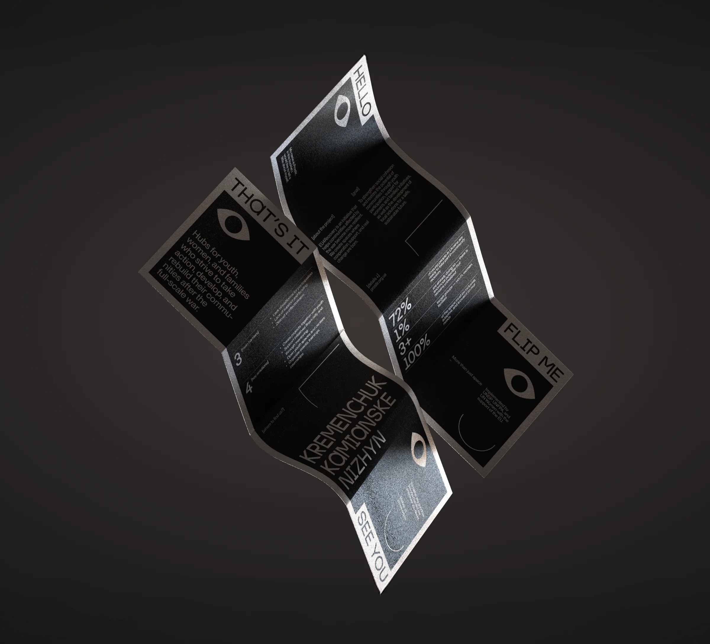
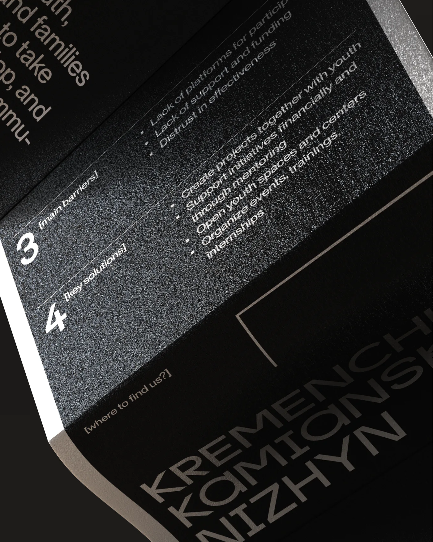
Prostir is a network of youth hubs in Kremenchuk, Nizhyn, and Kamianske — created to support young people in rebuilding their communities. While most youth are ready to contribute, few have access to safe, structured spaces where they can meet, learn, and act. Prostir bridges that gap. It's a place where young people solve their own challenges — and, in doing so, help solve the challenges of their communities. Prostir is a network of youth hubs in Kremenchuk, Nizhyn, and Kamianske — created to support young people in rebuilding their communities. While most youth are ready to contribute, few have access to safe, structured spaces where they can meet, learn, and act. Prostir bridges that gap. It's a place where young people solve their own challenges — and, in doing so, help solve the challenges of their communities.
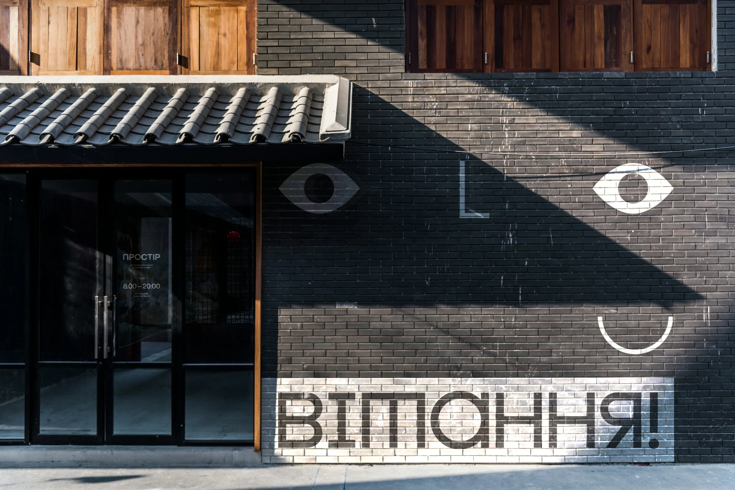
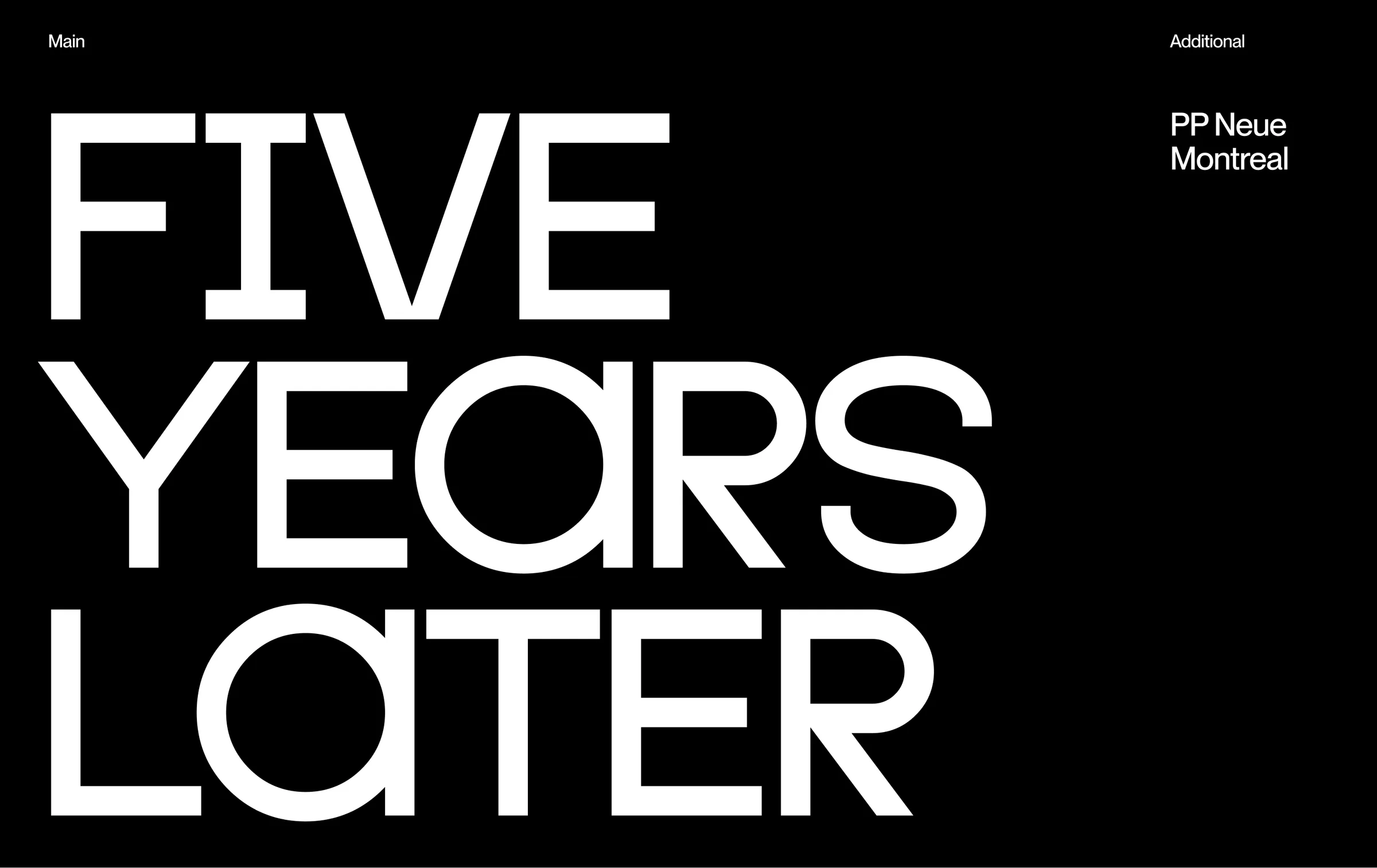
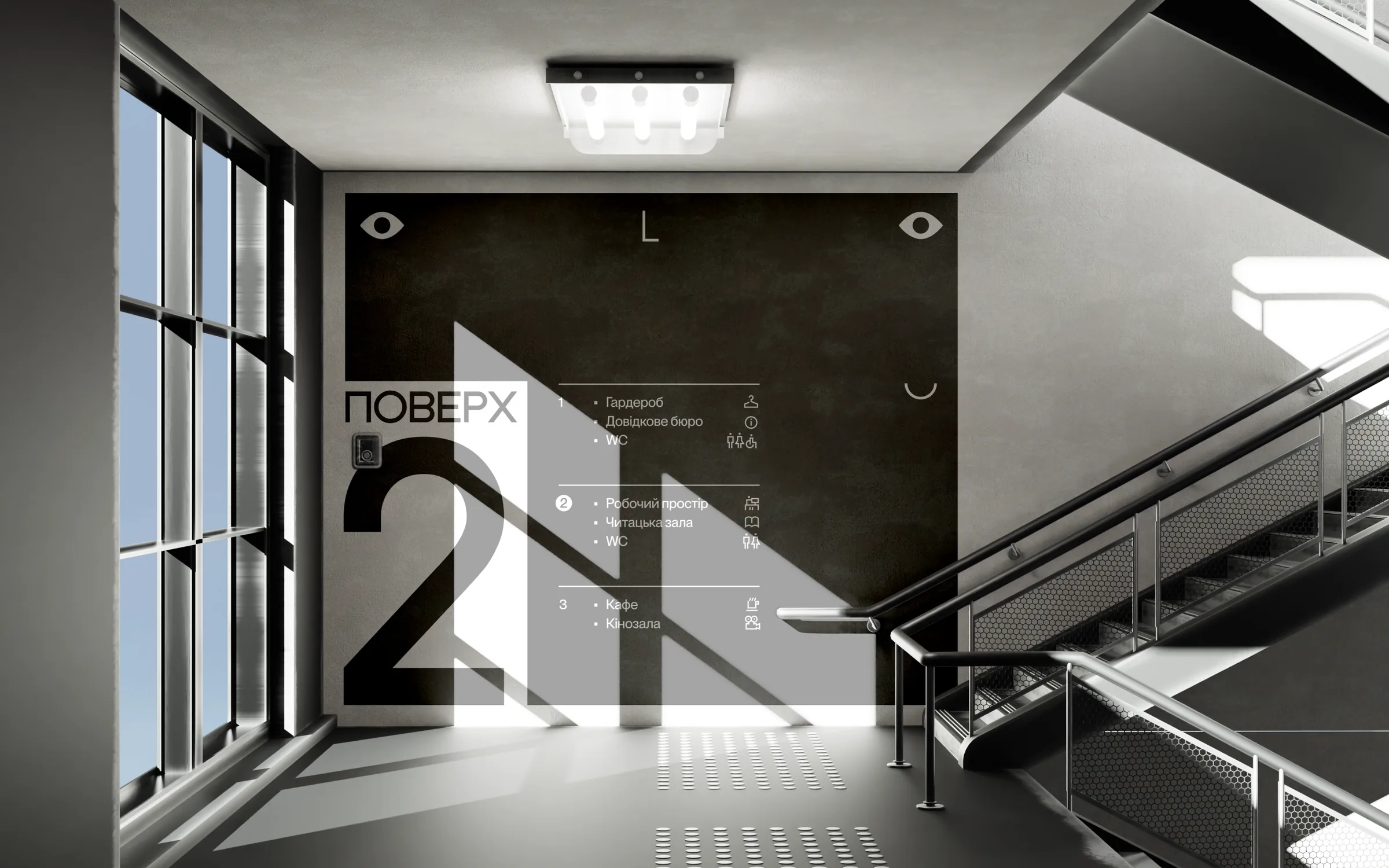
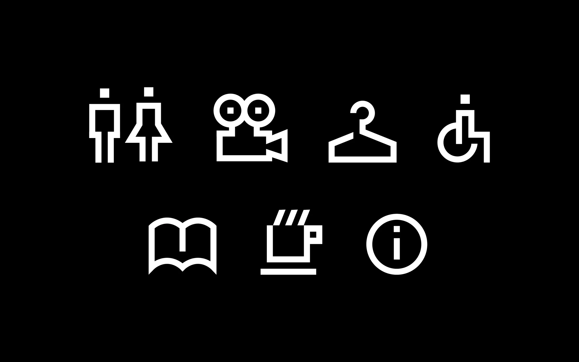
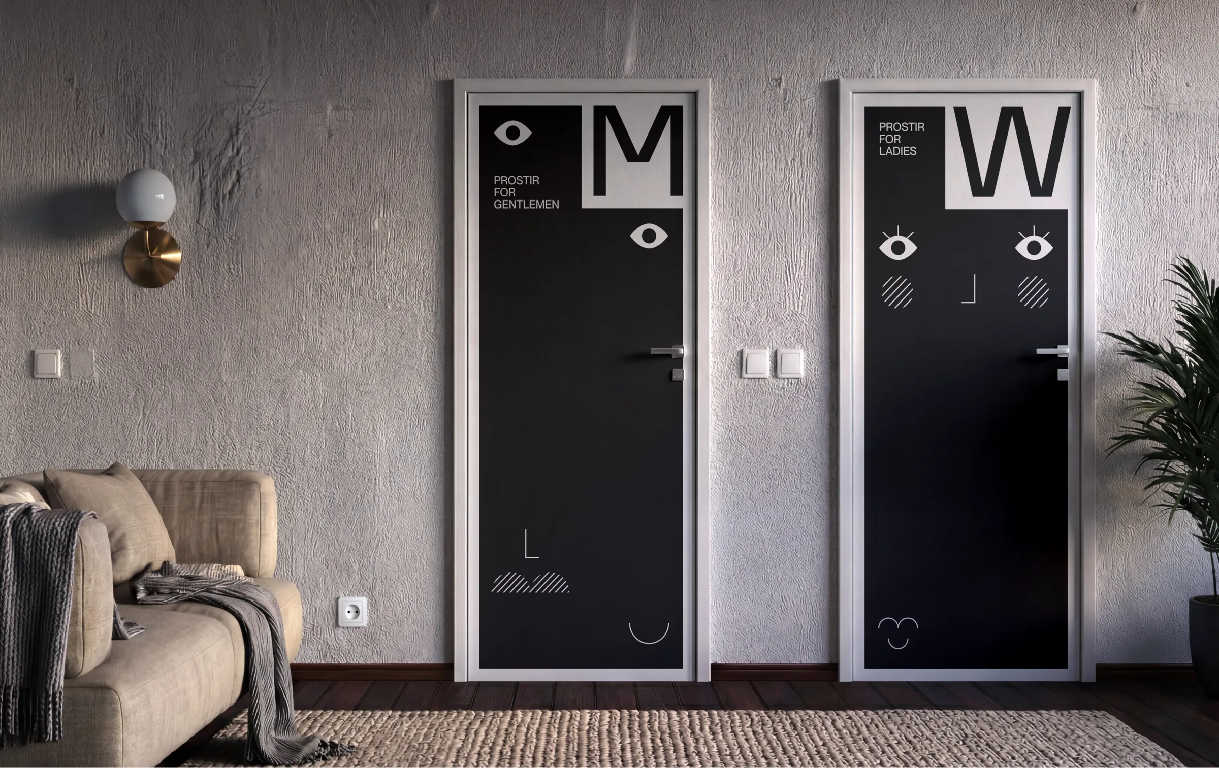
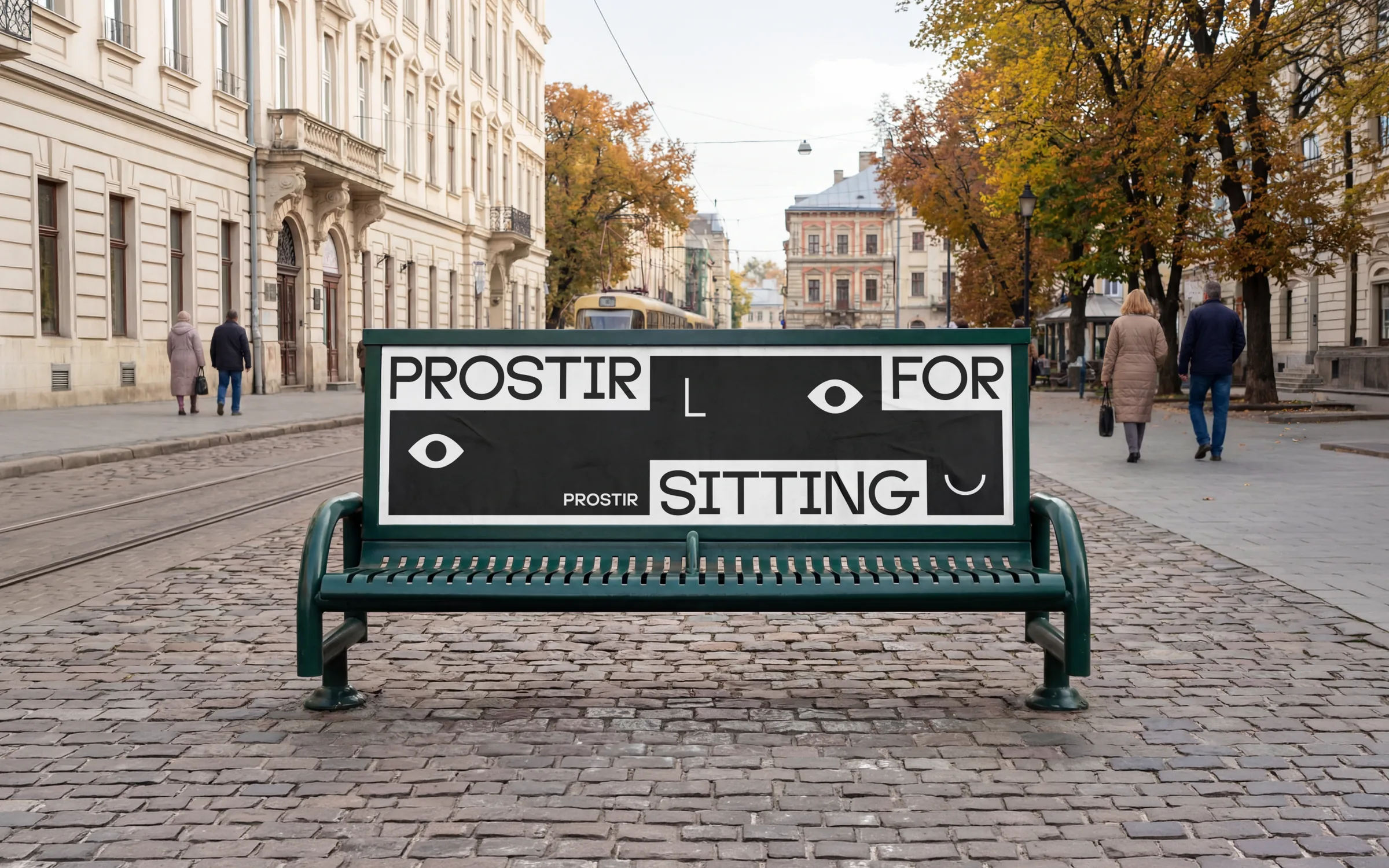
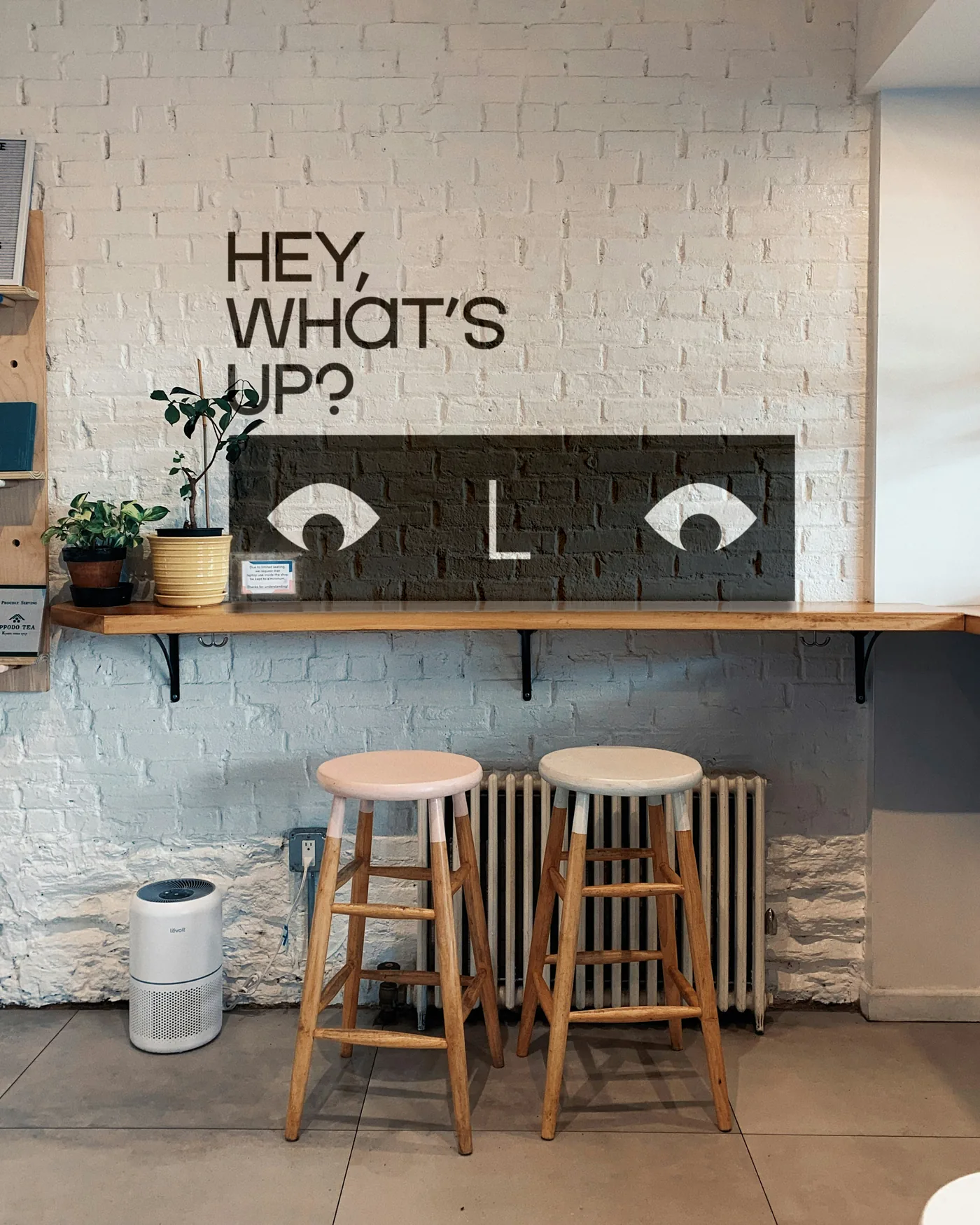
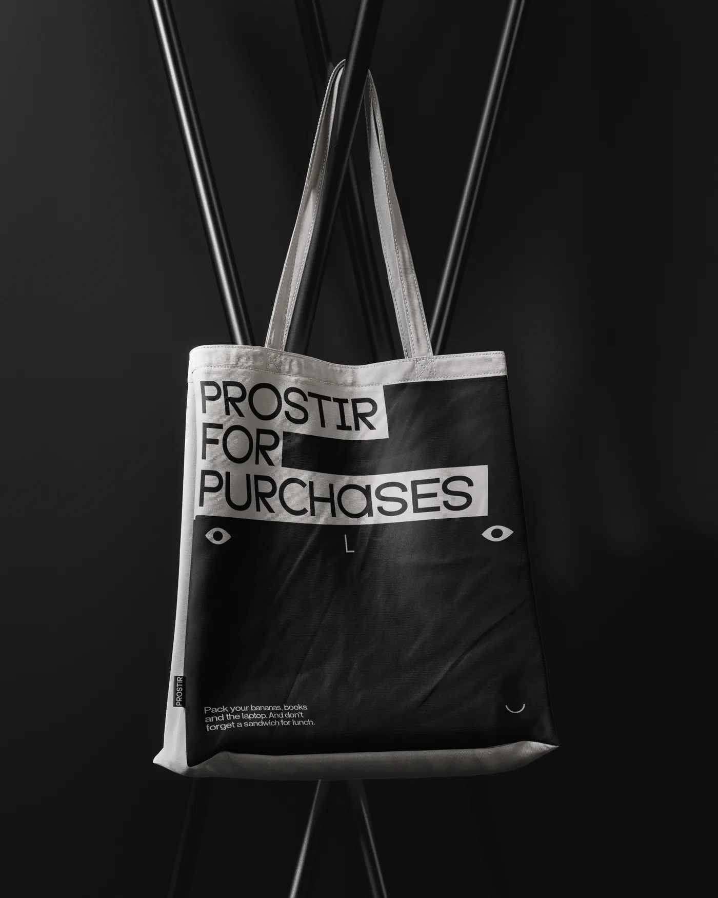
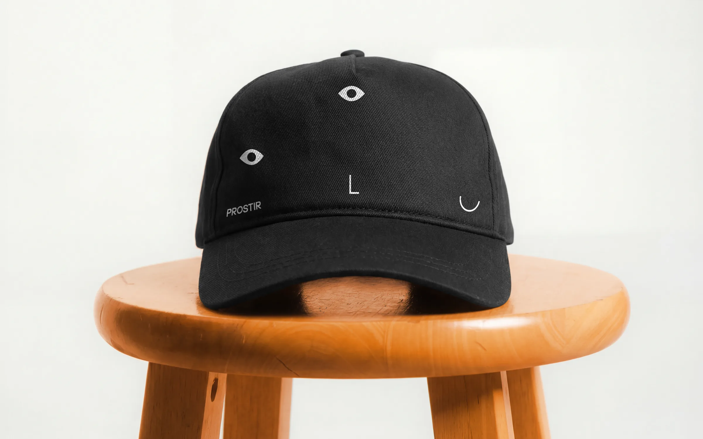
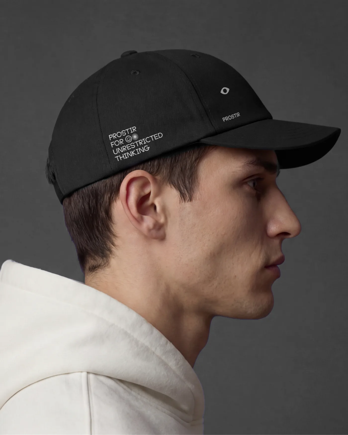
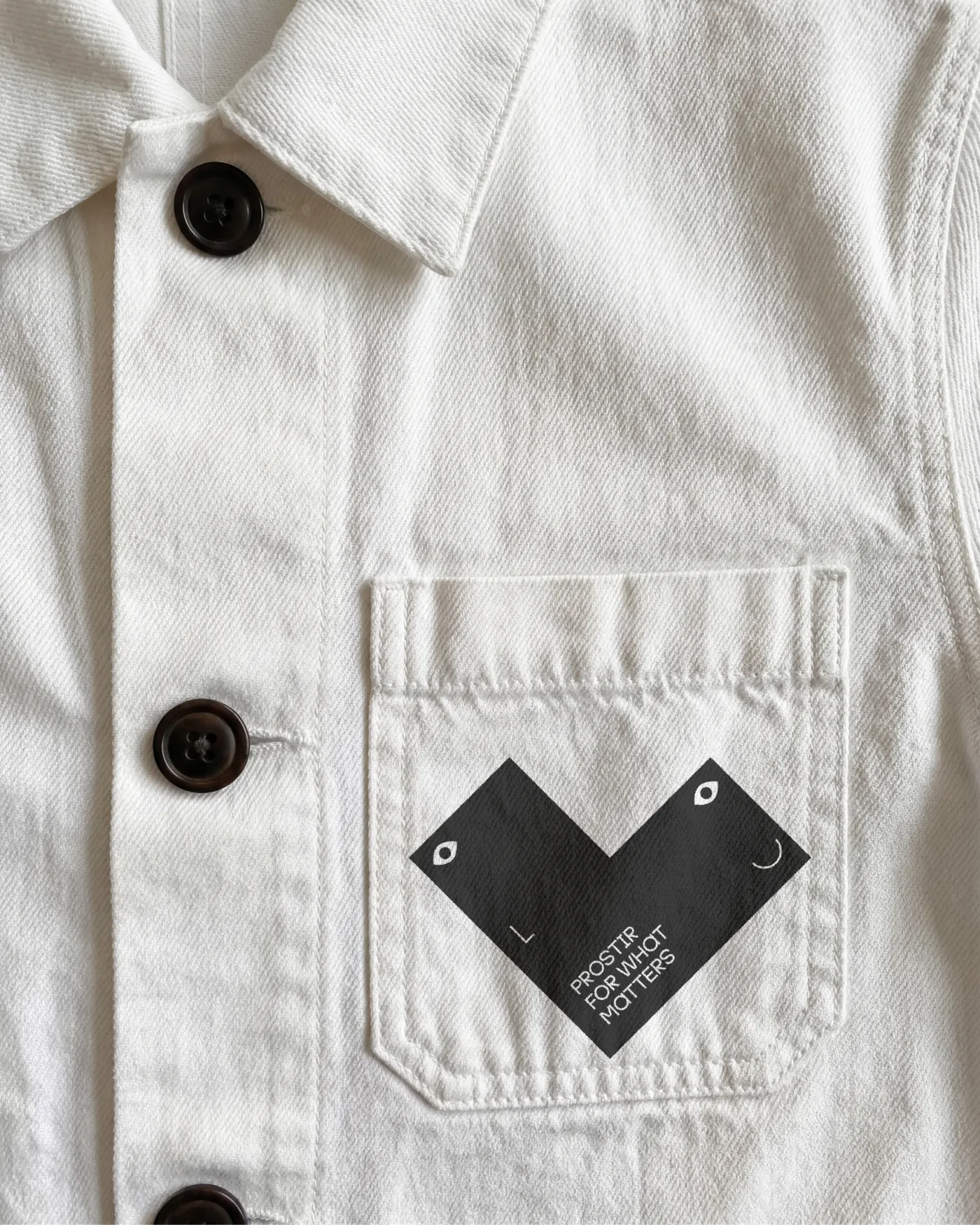
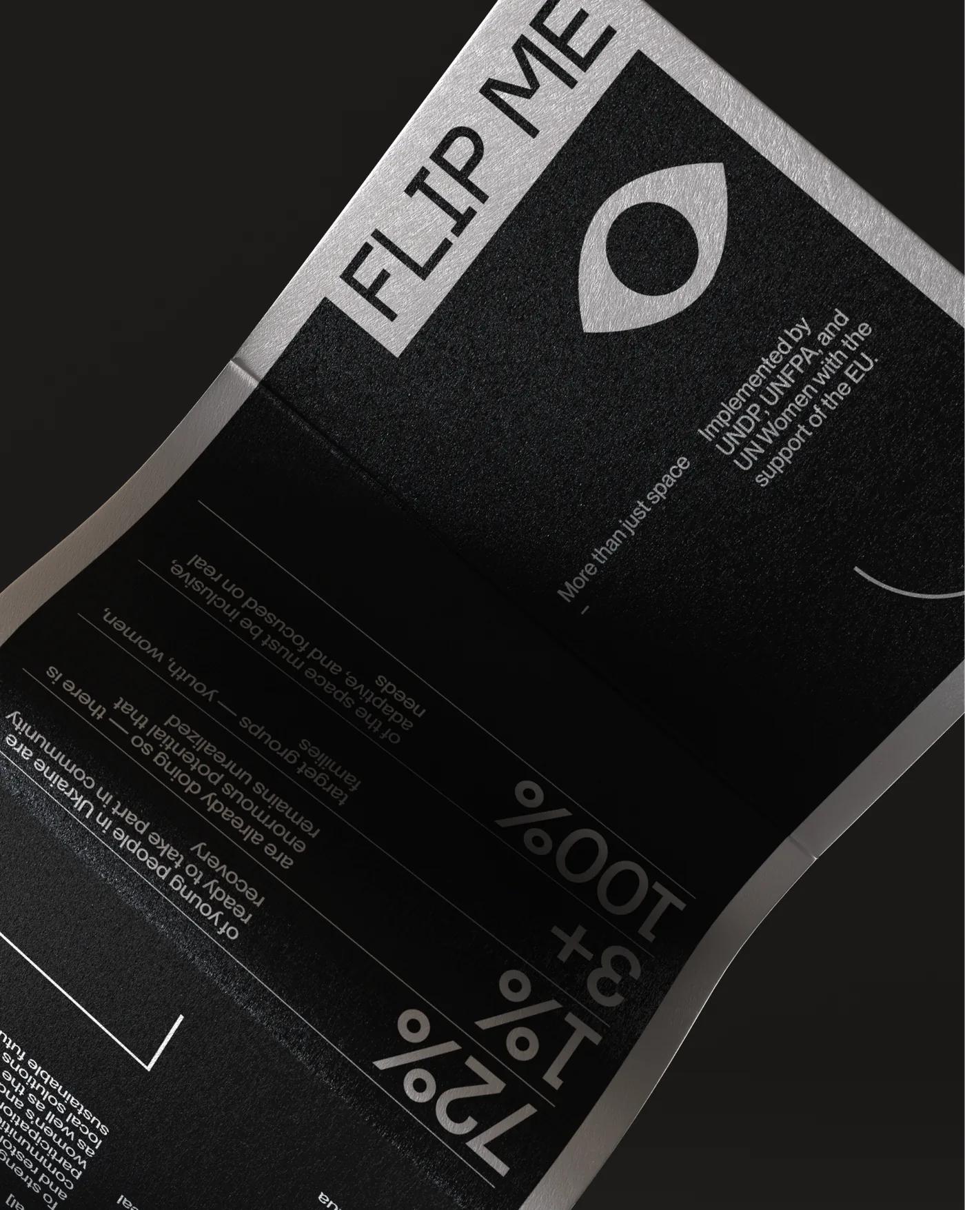
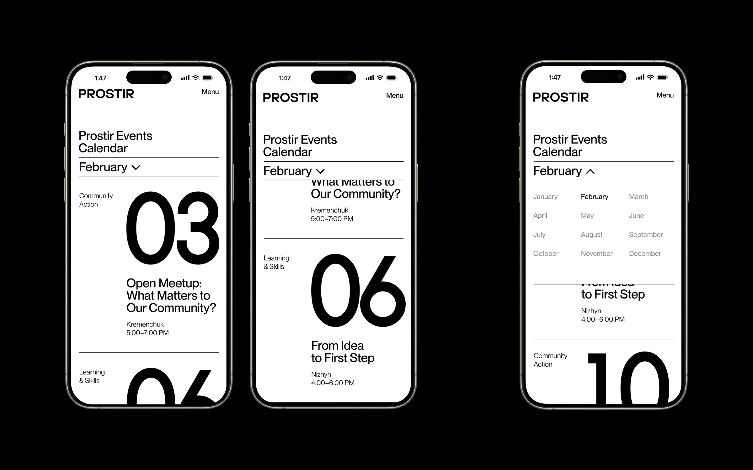
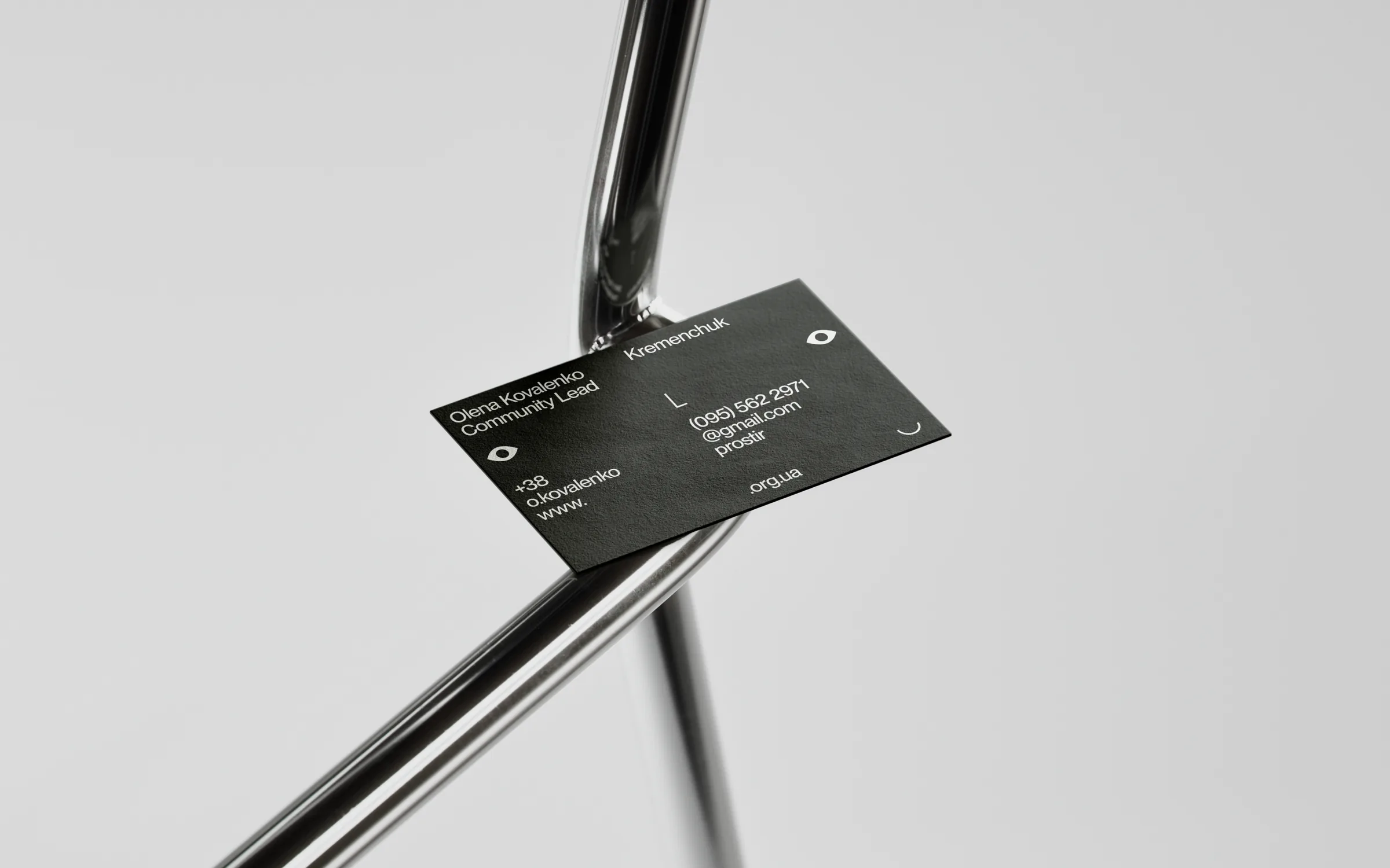
The core challenge was building an identity that could do a lot at once — scale across a growing network of hubs, work just as well on a wall as on a screen, and feel warm and human without tipping into forced cheerfulness. Most importantly, it needed to resonate with young people who have lived through war and feel authentic — while still being adaptable. Our answer was a dynamic visual system built around a modular shape and a living logo. The logo isn't static — eyes observe, expressions shift, elements rearrange — so the identity can change its mood without losing its coherence. And since we were working with a project that literally means “space,” and with a brand idea that sounds like “more than just space,” we decided to play with the space of each layout, turning it into something alive that reflects the individual challenges and problems of the people using these hubs. The core challenge was building an identity that could do a lot at once — scale across a growing network of hubs, work just as well on a wall as on a screen, and feel warm and human without tipping into forced cheerfulness. Most importantly, it needed to resonate with young people who have lived through war and feel authentic — while still being adaptable. Our answer was a dynamic visual system built around a modular shape and a living logo. The logo isn't static — eyes observe, expressions shift, elements rearrange — so the identity can change its mood without losing its coherence. And since we were working with a project that literally means “space,” and with a brand idea that sounds like “more than just space,” we decided to play with the space of each layout, turning it into something alive that reflects the individual challenges and problems of the people using these hubs.